Session 2 - Data Literacy: Beyond the Basics

3. Visulising your Data
3.2. Pivot Tables
Pivot Tables
Pivot tables are a powerful feature in spreadsheet software that allow users to quickly and easily analyze large datasets. They offer an interactive way to summarize, explore, and present information, making them incredibly useful for teachers looking to gain insights from student data. By simply dragging and dropping fields, teachers can use pivot tables to track student progress, analyze assessment results, explore demographic trends, and even inform resource allocation. This flexible tool empowers educators to make data-driven decisions, identify areas for improvement, and ultimately enhance the learning experience for their students.
Pivot Tables in Google Sheets
This guide will walk you through creating and using pivot tables in Google Sheets. We'll use a sample dataset, but you can easily adapt these steps to your own data.
1. Prepare Your Data:
- Organized Columns: Ensure your data is in a tabular format with clear column headers (e.g., Student Name, Subject, Grade, Attendance). Each column should represent a specific variable.
- Consistent Data Types: Keep data types consistent within each column (e.g., all grades as numbers, all names as text). This is crucial for accurate analysis.
- No Blank Rows/Columns: Avoid blank rows or columns within your data range, as this can confuse the pivot table.
- Example Data: Let's imagine a simplified example with columns: Student Name, Subject, Grade, and Attendance (represented as "Present" or "Absent").
2. Create the Pivot Table:

- Select Your Data: Click and drag to select the entire range of your data, including the header row.
- Insert Pivot Table: Go to Data > Pivot table.
- Choose Location: A dialog box will appear. Choose where you want to create the pivot table:
- New sheet: This is usually the best option.
- Existing sheet: Choose this if you want the pivot table on the same sheet as your data (but be careful not to overwrite anything).
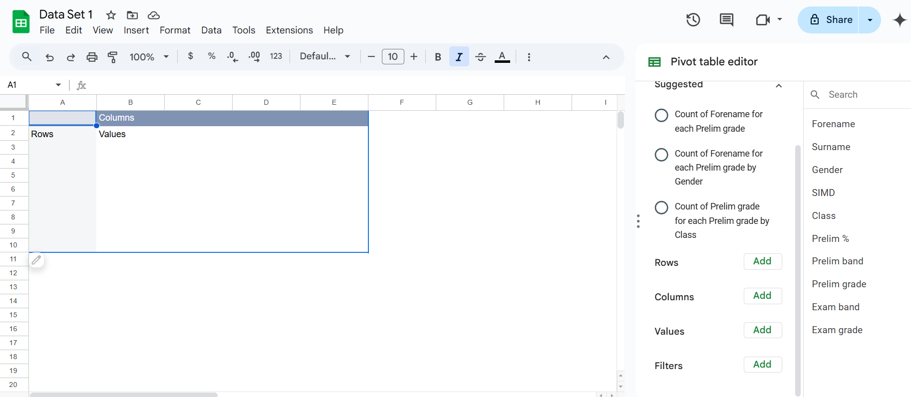
- Click "Create": This will open a new sheet (or the designated area) with an empty pivot table and the "Pivot table editor" on the right.
[
3. The Pivot Table Editor:
The editor is where you'll configure your pivot table. It has four main sections:
- Rows: Fields you want to appear as rows in your pivot table.
- Columns: Fields you want to appear as columns.
- Values: The data you want to summarize (e.g., sum, average, count).
- Filters: Used to filter the data included in the pivot table.
4. Building Your Pivot Table (Example Scenarios):
Scenario 1: Average Grade per Subject
- Rows: Drag "Subject" from the field list to the "Rows" section.
- Values: Drag "Grade" to the "Values" section. By default, it will probably show "SUM of Grade." Click on "SUM of Grade" and change the summarization to "AVERAGE."
Scenario 2: Number of Students Present/Absent in Each Subject
- Rows: Drag "Subject" to the "Rows" section.
- Columns: Drag "Attendance" to the "Columns" section.
- Values: Drag "Student Name" to the "Values" section. Change the summarization from "SUM" (which doesn't make sense here) to "COUNTA" (count of all entries). This will show the number of students (unique names) for each attendance status within each subject.
Scenario 3: Student Performance Breakdown (Grade by Subject)
- Rows: Drag "Student Name" to the "Rows" section.
- Columns: Drag "Subject" to the "Columns" section.
- Values: Drag "Grade" to the "Values" section. The default "SUM" will be used here and show the total grade for each student in each subject. You can change it to "AVERAGE" to see the average grade.
5. Filtering Data:
- Add a Filter: Drag a field (e.g., "Subject") to the "Filters" section.
- Select Filter Criteria: A filter control will appear above the pivot table. You can choose specific items to include or exclude (e.g., only show data for "Math").
6. Sorting Data:
- Sort by Row/Column: Click on the row or column header in the pivot table to sort the data in ascending or descending order.
7. Formatting:
- Number Formatting: Format the values in your pivot table (e.g., decimals, currency) just like you would in a regular spreadsheet.
- Conditional Formatting: Apply conditional formatting to highlight specific values (e.g., highlight failing grades).
8. Exploring and Iterating:
The real power of pivot tables comes from experimentation. Try different combinations of rows, columns, values, and filters to gain new insights from your data. The changes you make in the Pivot table editor are reflected instantly in the pivot table itself.
9. Refreshing the Pivot Table:
If you make changes to your original data, you'll need to refresh the pivot table to reflect those changes. Right-click anywhere within the pivot table and select "Refresh."
Example with More Detail (Scenario 1):
Let's say your data looks like this (simplified):
| Student Name | Subject | Grade | Attendance |
|---|---|---|---|
| Alice | Math | 85 | Present |
| Bob | Science | 78 | Present |
| Carol | Math | 92 | Present |
| David | Science | 80 | Absent |
| Eve | Math | 75 | Present |
Following the steps for Scenario 1 (Average Grade per Subject) would create a pivot table like this:
| Subject | AVERAGE of Grade |
|---|---|
| Math | 84 |
| Science | 79 |
This shows you at a glance the average grade for each subject.
This guide provides a solid foundation for using pivot tables. As you become more comfortable, you can explore more advanced features like calculated fields and grouping. Don't be afraid to experiment! The best way to learn is by doing.
Pivot Tables in Excel
This guide will walk you through creating and using pivot tables in Microsoft Excel. We'll use a sample dataset, but you can easily adapt these steps to your own data.
1. Prepare Your Data:
- Organized Columns: Ensure your data is in a tabular format with clear column headers (e.g., Student Name, Subject, Grade, Attendance). Each column should represent a specific variable.
- Consistent Data Types: Keep data types consistent within each column (e.g., all grades as numbers, all names as text). This is crucial for accurate analysis.
- No Blank Rows/Columns: Avoid blank rows or columns within your data range, as this can confuse the pivot table.
- Example Data: Let's imagine a simplified example with columns: Student Name, Subject, Grade, and Attendance (represented as "Present" or "Absent").
2. Create the Pivot Table:
- Select Your Data: Click and drag to select the entire range of your data, including the header row.
- Insert Pivot Table: Go to the Insert tab on the Excel ribbon and click PivotTable.
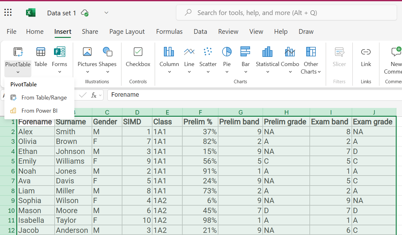
- Choose Location: A dialog box will appear. Choose where you want to create the pivot table:
- New Worksheet: This is usually the best option.
- Existing Worksheet: Choose this if you want the pivot table on the same sheet as your data (but be careful not to overwrite anything).
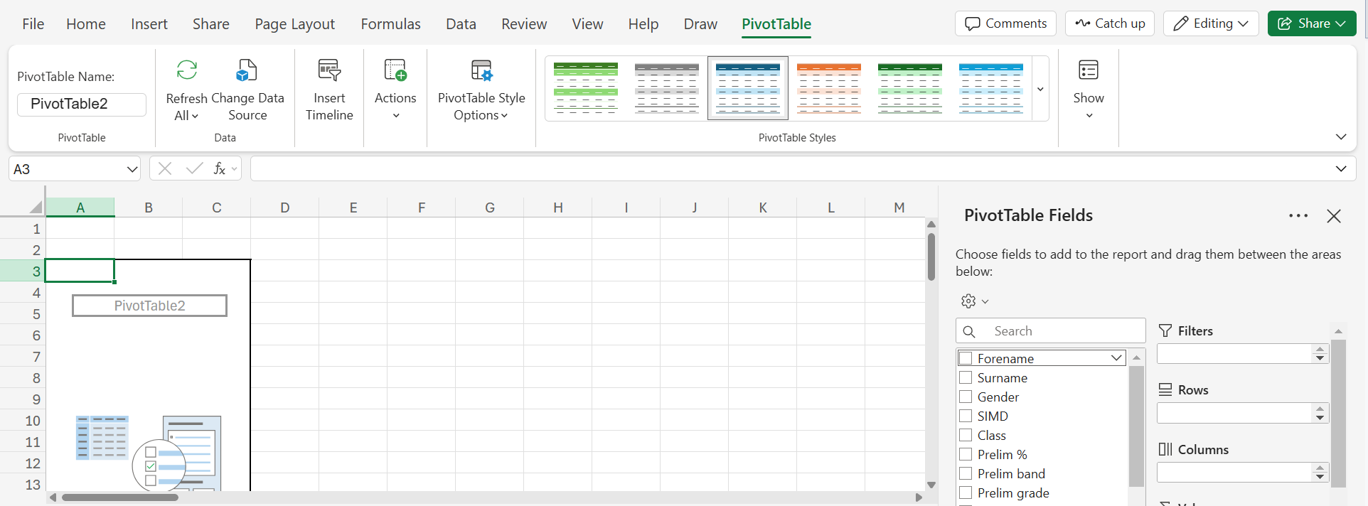
- Click "OK": This will open a new worksheet (or the designated area) with an empty pivot table and the "PivotTable Fields" pane on the right.
3. The PivotTable Fields Pane:
The pane is where you'll configure your pivot table. It has four main areas:
- Filters: Used to filter the data included in the pivot table.
- Columns: Fields you want to appear as columns.
- Rows: Fields you want to appear as rows.
- Values: The data you want to summarize (e.g., sum, average, count).
4. Building Your Pivot Table (Example Scenarios):
Scenario 1: Average Grade per Subject
- Rows: Drag "Subject" from the field list to the "Rows" area.
- Values: Drag "Grade" to the "Values" area. By default, it will probably show "Sum of Grade." Click on the dropdown arrow next to "Sum of Grade" in the Values area, select "Value Field Settings," and change the summarization to "Average."
Scenario 2: Number of Students Present/Absent in Each Subject
- Rows: Drag "Subject" to the "Rows" area.
- Columns: Drag "Attendance" to the "Columns" area.
- Values: Drag "Student Name" to the "Values" area. Click on the dropdown arrow next to "Sum of Student Name" in the Values area, select "Value Field Settings," and change the summarization to "Count." This will show the number of students (unique names) for each attendance status within each subject.
Scenario 3: Student Performance Breakdown (Grade by Subject)
- Rows: Drag "Student Name" to the "Rows" area.
- Columns: Drag "Subject" to the "Columns" area.
- Values: Drag "Grade" to the "Values" area. The default "Sum" will be used here and show the total grade for each student in each subject. You can change it to "Average" to see the average grade.
5. Filtering Data:
- Add a Filter: Drag a field (e.g., "Subject") to the "Filters" area.
- Select Filter Criteria: A filter control will appear above the pivot table. You can choose specific items to include or exclude (e.g., only show data for "Math").
6. Sorting Data:
- Sort by Row/Column: Click on the row or column header in the pivot table to sort the data in ascending or descending order.
7. Formatting:
- Number Formatting: Format the values in your pivot table (e.g., decimals, currency) just like you would in a regular spreadsheet.
- Conditional Formatting: Apply conditional formatting to highlight specific values (e.g., highlight failing grades).
8. Exploring and Iterating:
The real power of pivot tables comes from experimentation. Try different combinations of rows, columns, values, and filters to gain new insights from your data. The changes you make in the PivotTable Fields pane are reflected instantly in the pivot table itself.
9. Refreshing the Pivot Table:
If you make changes to your original data, you'll need to refresh the pivot table to reflect those changes. Right-click anywhere within the pivot table and select "Refresh."
Example with More Detail (Scenario 1):
Let's say your data looks like this (simplified):
| Student Name | Subject | Grade | Attendance |
|---|---|---|---|
| Alice | Math | 85 | Present |
| Bob | Science | 78 | Present |
| Carol | Math | 92 | Present |
| David | Science | 80 | Absent |
| Eve | Math | 75 | Present |
Following the steps for Scenario 1 (Average Grade per Subject) would create a pivot table like this:
| Subject | Average of Grade |
|---|---|
| Math | 84 |
| Science | 79 |
This shows you at a glance the average grade for each subject.
This guide provides a solid foundation for using pivot tables. As you become more comfortable, you can explore more advanced features like calculated fields and grouping. Don't be afraid to experiment! The best way to learn is by doing.