Session 2 - Data Literacy: Beyond the Basics
| Site: | CLPL |
| Course: | Data Champions |
| Book: | Session 2 - Data Literacy: Beyond the Basics |
| Printed by: | Guest user |
| Date: | Saturday, 5 September 2026, 12:06 AM |
Description

1. Getting the Most From your Data
2. Data Literacy
Data literacy is a crucial skill for educators in today's data-driven world. It empowers you to make informed decisions about instruction, improve student outcomes, and contribute to a positive data culture within your school.
Why is Data Literacy Important in Scottish Teaching?
Education Scotland's rapid evidence review highlights the importance of data for effective school improvement. Here's how data literacy benefits teachers:
-
Improves Decision-Making: Data provides evidence to support instructional choices, resource allocation, and targeted interventions. You can move beyond "gut feeling" and base your decisions on concrete information.
-
Informs Targeted Support: By analyzing data on student achievement, learning styles, and needs, you can identify students who require additional support or differentiation. This allows you to tailor your instruction to individual learners.
-
Tracks Progress and Identifies Trends: Data helps you monitor student progress over time and identify areas where the whole class or specific groups may be struggling. This allows for timely adjustments to teaching strategies.
-
Promotes Collaboration: Data analysis can be a collaborative process. By sharing and discussing data with colleagues, you can gain new insights and develop effective improvement strategies together.
-
Empowers Learners: When students understand their own data and are involved in setting learning goals, they become more invested in their learning journey. Data literacy can foster a growth mindset in students.
Key Concepts for Data Literacy
-
Data Types: Understanding the difference between quantitative data (numerical) and qualitative data (descriptive) is crucial for choosing appropriate analysis methods.
-
Data Collection: Gathering data efficiently and accurately is essential. This may involve using existing school data, conducting assessments, or collecting student feedback.
-
Data Analysis: Techniques like descriptive statistics, data visualization, and identifying trends help you extract meaning from data.
-
Data Interpretation: Drawing meaningful conclusions from data requires considering factors like context, limitations, and potential bias.
-
Data Communication: Effectively communicating data insights to colleagues, parents, and students is vital for building a data-driven culture.
Developing a Data Culture in Schools
Education Scotland emphasizes the importance of a shared understanding of data and its uses within the school community. Here are some key aspects:
-
Clear Roles and Expectations: All staff, including classroom practitioners and support staff, should understand their roles in data collection, analysis, and utilization.
-
Professional Development: Providing training opportunities can help teachers develop their data literacy skills and confidence in using data to inform instruction.
-
Collaboration and Dialogue: Encourage teachers to discuss data with colleagues, share best practices, and engage in "data-driven dialogues" to make informed decisions collaboratively.
-
Focus on Improvement: Data should be used to identify areas for improvement, not for blame or judgment. A positive and growth-oriented approach is essential.
By embracing data literacy, Scottish teachers can leverage the power of data to create a more effective and student-centered learning environment.
3. Visulising your Data
Data Visualization Basics
Data visualization is the art and science of representing data graphically. By transforming raw data into visual formats like charts and graphs, you can:
- Communicate complex information clearly and concisely.
- Identify patterns, trends, and anomalies that might be difficult to spot in raw data.
- Engage your audience and make data more interesting and memorable.
Principles of Effective Visualization
- Clarity: The visualization should be easy to understand at a glance. Avoid clutter and unnecessary details.
- Accuracy: The visualization must accurately reflect the data and avoid misleading interpretations.
- Aesthetics: While clarity is paramount, an aesthetically pleasing visualization can enhance engagement and improve understanding. Use color, typography, and spacing effectively.
Choosing the Right Chart Type
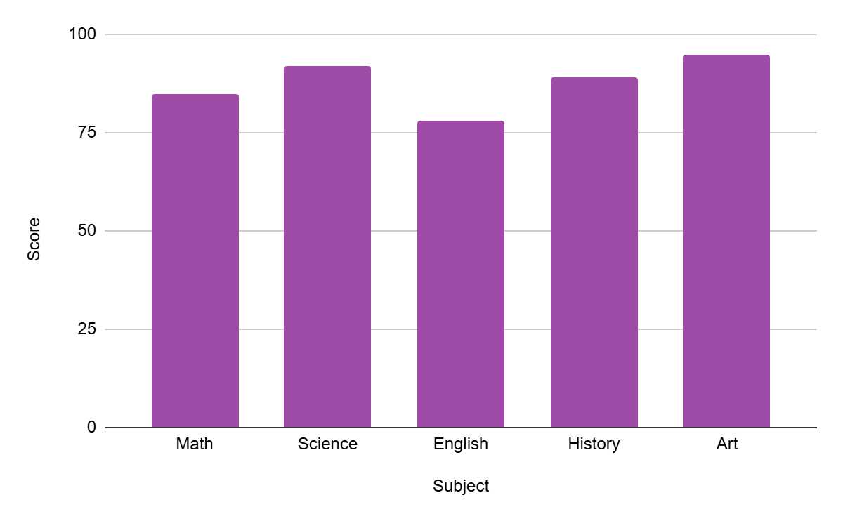
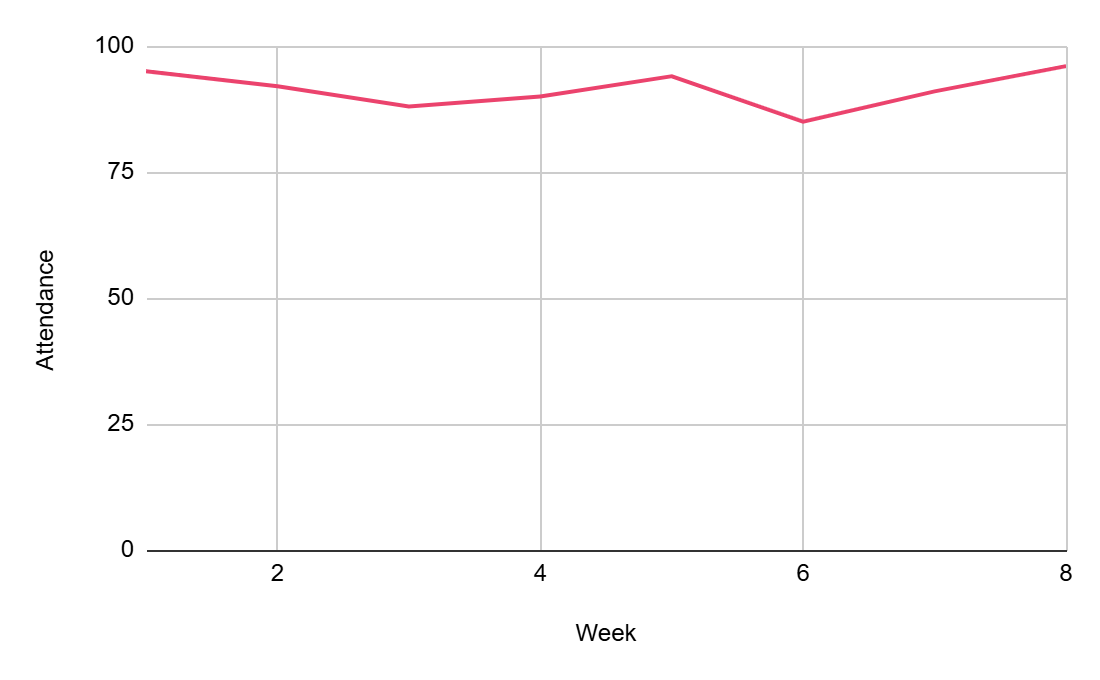
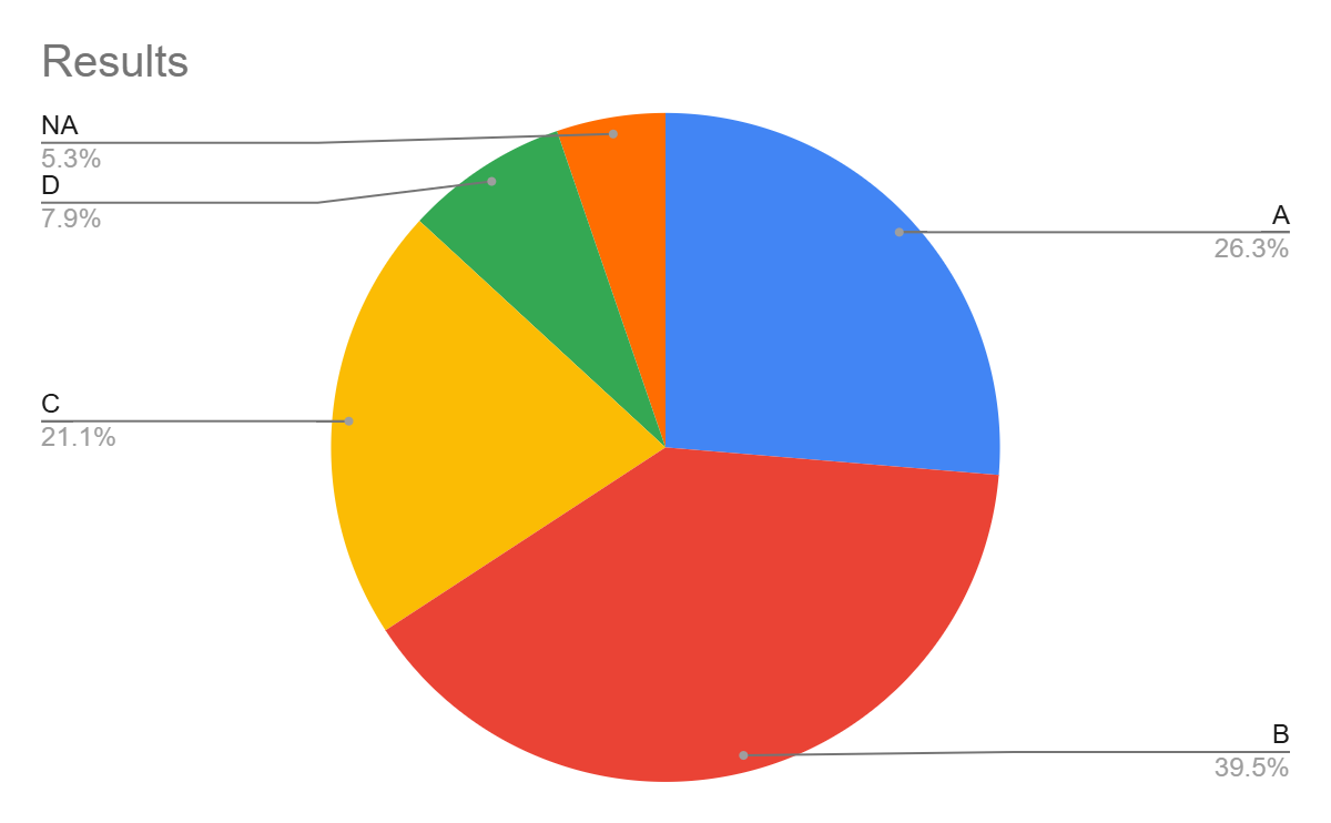
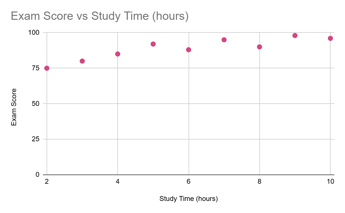
The choice of chart type depends on the type of data you are presenting and the message you want to convey. Some common chart types include:
Bar Charts
|
 |
|
Line Graphs:
|
 |
|
Pie Charts:
|
 |
|
Scatter Plots:
|
 |
|
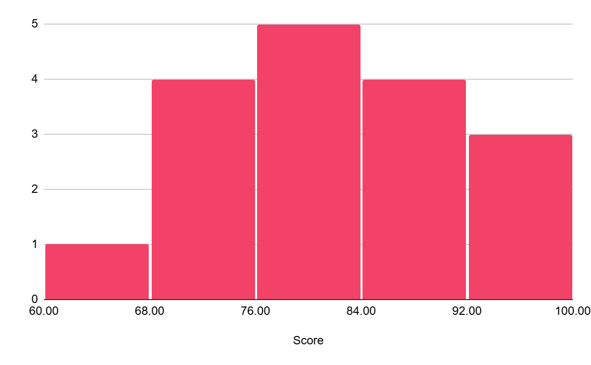
Histograms:
|
 |
Best Practices for Labeling and Formatting
- Clear Titles and Labels:
- Use concise and informative titles that accurately describe the visualization.
- Label axes clearly and include units of measurement (e.g., "Number of Students," "Years").
- Data Labels:
- Add data labels to individual data points to provide specific values.
- Use data labels judiciously to avoid cluttering the chart.
- Legends:
- Create clear and concise legends to explain the meaning of different colours, symbols, or patterns.
- Colour:
- Use colour effectively to highlight key trends, group data, and improve readability.
- Avoid using too many colours, which can be overwhelming.
- Font Choices:
- Use clear and easy-to-read fonts.
- Avoid using too many different fonts, which can make the visualization look cluttered.
- Whitespace:
- Use whitespace effectively to create visual breathing room and improve readability.
By following these principles and best practices, you can create effective and informative data visualizations that effectively communicate your findings.
3.1. Conditional Formatting
Conditional Formatting
|
|
Formatted Data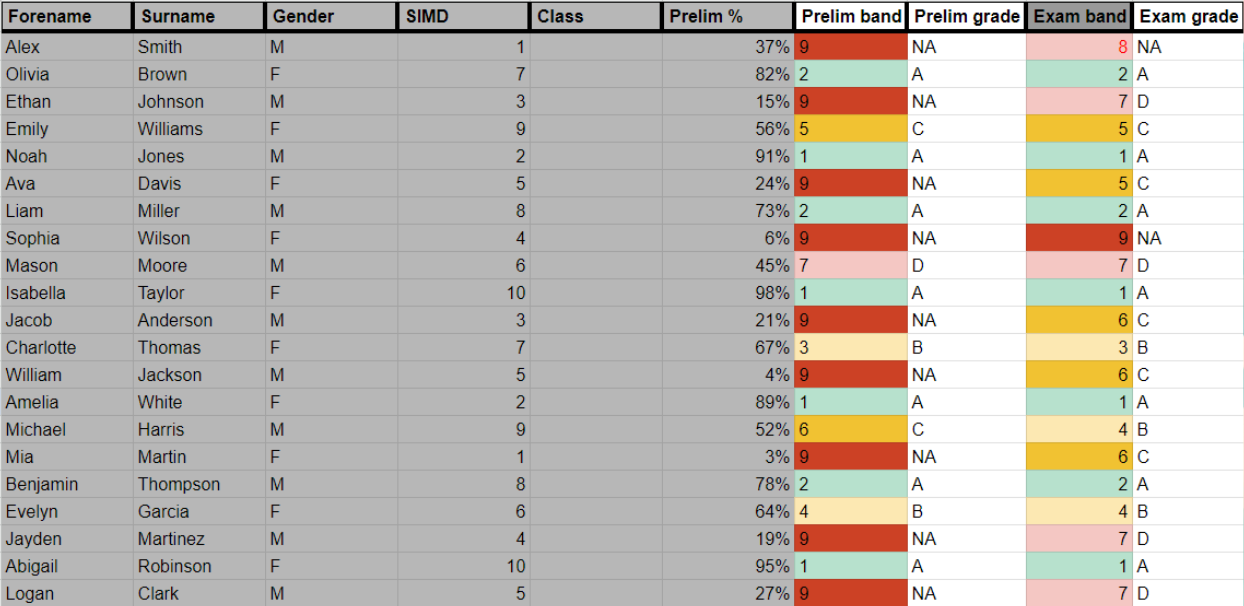 |
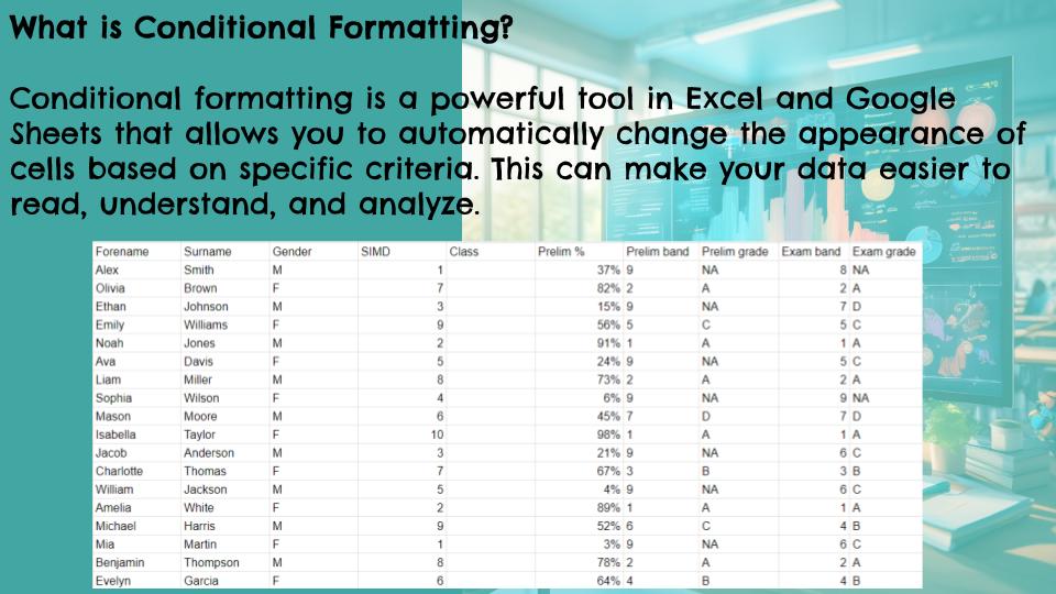
Using Google Sheets: Conditional Formatting
Conditional formatting in Google Sheets lets you automatically apply formatting (like colours, bolding, or italics) to cells based on their values or formulas. This makes it easy to visualize data, highlight important information, and identify trends.
What is Conditional Formatting?
Conditional formatting allows you to set rules that, when met, trigger specific formatting changes in cells. For example, you could highlight all cells containing values greater than 100 in green, or make all dates in the past appear in red.
How to Access Conditional Formatting:
- Select the Range: First, select the cells you want to apply conditional formatting to. This can be a single cell, a range of cells, an entire column, or even multiple non-contiguous ranges.
- Open the Conditional Format Rules Panel: Go to Format > Conditional formatting in the menu. This will open the Conditional format rules panel on the right side of your sheet.
Applying Conditional Formatting Rules:
The Conditional format rules panel is where you'll define your rules. Here's a breakdown of the key sections:
1. Apply to range:
This shows the selected range where the conditional formatting will be applied. You can adjust the range here if needed.
2. Format rules:
This is where you define the actual formatting rules.
- Format rules dropdown: This dropdown offers various pre-built rules, categorized as follows:
- Format cells if...: These rules are based on cell values (e.g., greater than, less than, between, equal to, contains text, date is, etc.).
- Colour scale: These rules create a gradient of colours based on cell values. Useful for visualizing data ranges.
- Data bars: These rules add bars to cells, visually representing the cell values relative to other values in the range.
- Icon sets: These rules add icons to cells, representing the cell values (e.g., arrows, flags, symbols).
- Custom formula is: This option allows you to create complex rules using formulas. This is very powerful for more advanced conditional formatting.
- Preview: This shows you a preview of how the formatting will look when the rule is applied.
- Formatting style: This section lets you choose the formatting to apply when the rule is met (e.g., background colour, text colour, bold, italics, etc.).
3. Add another rule:
You can add multiple conditional formatting rules to the same range. Rules are evaluated in order, and the first rule that is met will be applied. You can reorder or delete rules as needed.
Example 1: Highlighting Cells Greater Than a Value
- Select the range of cells you want to format.
- Open the Conditional format rules panel (Format > Conditional formatting).
- In the "Format rules" section, choose "Greater than" from the "Format cells if..." dropdown.
- Enter the value you want to compare against (e.g., 100).
- Choose the formatting you want to apply (e.g., change the background colour to green).
- Click "Done".
Example 2: Using a Custom Formula
Let's say you want to highlight rows where the value in column A is greater than the value in column B.
- Select the range of cells you want to format (including columns A and B).
- Open the Conditional format rules panel.
- In the "Format rules" section, choose "Custom formula is" from the "Format cells if..." dropdown.
- Enter the following formula:
=$A1>$B1(The `$` before A and B makes the column reference absolute, so it always compares the corresponding values in columns A and B, even if the formatting is applied to other columns.) - Choose the formatting you want to apply.
- Click "Done".
Important Considerations:
- Rule Order: The order of your conditional formatting rules matters. The first rule that evaluates to TRUE will be applied.
- Absolute and Relative References: When using custom formulas, be mindful of absolute (
$A$1) and relative (A1) cell references. Absolute references stay fixed when the formatting is applied to other cells, while relative references adjust. - Deleting Rules: You can delete conditional formatting rules from the Conditional format rules panel.
Conditional formatting is a powerful tool for data analysis and visualization in Google Sheets. By mastering these techniques, you can make your spreadsheets more informative and easier to understand.
Using Microsoft Excel: Conditional Formatting
Conditional formatting in Excel allows you to automatically apply formatting (like colours, bolding, or italics) to cells based on their values or formulas. This makes it easy to visualize data, highlight important information, and identify trends.
What is Conditional Formatting?
Conditional formatting allows you to set rules that, when met, trigger specific formatting changes in cells. For example, you could highlight all cells containing values greater than 100 in green, or make all dates in the past appear in red.
How to Access Conditional Formatting:
- Select the Range: First, select the cells you want to apply conditional formatting to. This can be a single cell, a range of cells, an entire column, or even multiple non-contiguous ranges.
- Open the Conditional Formatting Menu: Go to the Home tab on the ribbon, and in the Styles group, click Conditional Formatting. This will open a dropdown menu with various options.
Applying Conditional Formatting Rules:
The Conditional Formatting menu offers various options for creating and managing rules. Here's a breakdown of the key features:
1. Highlight Cells Rules:
This option provides pre-built rules based on cell values (e.g., Greater Than, Less Than, Between, Equal To, Text that Contains, A Date Occurring, Duplicate Values).
2. Top/Bottom Rules:
This option allows you to format the top or bottom N items (e.g., Top 10 Items, Bottom 10%, Above Average, Below Average).
3. Data Bars:
These rules add bars to cells, visually representing the cell values relative to other values in the range.
4. Color Scales:
These rules create a gradient of colours based on cell values. Useful for visualizing data ranges.
5. Icon Sets:
These rules add icons to cells, representing the cell values (e.g., arrows, flags, symbols).
6. New Rule...:
This option opens the "New Formatting Rule" dialogue box, giving you more control over creating custom rules.
7. Clear Rules:
This option lets you clear conditional formatting rules from selected cells or the entire sheet.
8. Manage Rules...:
This option opens the "Conditional Formatting Rules Manager" dialogue box, where you can edit, delete, or change the order of existing rules.
Example 1: Highlighting Cells Greater Than a Value
- Select the range of cells you want to format.
- Go to Home > Conditional Formatting > Highlight Cells Rules > Greater Than...
- Enter the value you want to compare against (e.g., 100).
- Choose the formatting you want to apply (e.g., change the fill colour to green) from the dropdown menu or click the "Custom Format..." button for more options.
- Click "OK".
Example 2: Using a Formula to Determine Formatting
Let's say you want to highlight rows where the value in column A is greater than the value in column B.
- Select the range of cells you want to format (including columns A and B).
- Go to Home > Conditional Formatting > New Rule...
- Select "Use a formula to determine which cells to format".
- Enter the following formula:
=$A1>$B1(The `$` before A and B makes the column reference absolute, so it always compares the corresponding values in columns A and B, even if the formatting is applied to other columns.) - Click the "Format..." button and choose the formatting you want to apply.
- Click "OK" twice.
Important Considerations:
- Rule Order: The order of your conditional formatting rules matters. The first rule that evaluates to TRUE will be applied. You can manage the rule order in the "Conditional Formatting Rules Manager".
- Absolute and Relative References: When using formulas, be mindful of absolute (
$A$1) and relative (A1) cell references. Absolute references stay fixed when the formatting is applied to other cells, while relative references adjust. - Clearing Rules: You can clear conditional formatting rules from selected cells or the entire worksheet using the "Clear Rules" option in the Conditional Formatting menu.
Conditional formatting is a powerful tool for data analysis and visualization in Excel. By mastering these techniques, you can make your spreadsheets more informative and easier to understand.
Have a try at some conditional formatting by copying and pasting this demo data into a spreadsheet
| Forename | Surname | Gender | SIMD | Class | Prelim % | Prelim band | Prelim grade | Exam band | Exam grade |
|---|---|---|---|---|---|---|---|---|---|
| Alex | Smith | M | 1 | 1A1 | 37% | 9 | NA | 8 | NA |
| Olivia | Brown | F | 7 | 1A1 | 82% | 2 | A | 2 | A |
| Ethan | Johnson | M | 3 | 1A1 | 15% | 9 | NA | 7 | D |
| Emily | Williams | F | 9 | 1A1 | 56% | 5 | C | 5 | C |
| Noah | Jones | M | 2 | 1A1 | 91% | 1 | A | 1 | A |
| Ava | Davis | F | 5 | 1A1 | 24% | 9 | NA | 5 | C |
| Liam | Miller | M | 8 | 1A1 | 73% | 2 | A | 2 | A |
| Sophia | Wilson | F | 4 | 1A2 | 6% | 9 | NA | 9 | NA |
| Mason | Moore | M | 6 | 1A2 | 45% | 7 | D | 7 | D |
| Isabella | Taylor | F | 10 | 1A2 | 98% | 1 | A | 1 | A |
| Jacob | Anderson | M | 3 | 1A2 | 21% | 9 | NA | 6 | C |
| Charlotte | Thomas | F | 7 | 1A2 | 67% | 3 | B | 3 | B |
| William | Jackson | M | 5 | 1A2 | 4% | 9 | NA | 6 | C |
| Amelia | White | F | 2 | 1A2 | 89% | 1 | A | 1 | A |
| Michael | Harris | M | 9 | 1A2 | 52% | 6 | C | 4 | B |
| Mia | Martin | F | 1 | 1A2 | 3% | 9 | NA | 6 | C |
| Benjamin | Thompson | M | 8 | 1A2 | 78% | 2 | A | 2 | A |
| Evelyn | Garcia | F | 6 | 1A2 | 64% | 4 | B | 4 | B |
Why don't you try:
1. Prelim % (Column E):
- Color Scale: Apply a color scale to visually represent the range of percentages. Use a gradient from red (low percentages) to green (high percentages). This provides an immediate visual cue for how well students performed.
- Icon Sets: Use icon sets with directional arrows (up, down, sideways) to indicate performance relative to the class average or a target percentage.
2. Prelim Band and Grade (Columns F and G):
- Highlight Top Performers: Use a distinct color (e.g., light green) to highlight cells with the highest grade bands (e.g., "1A").
- Highlight Students Needing Support: Use a different color (e.g., light red) to highlight cells with the lowest grade bands (e.g., "9N").
3. Exam Band and Grade (Columns I and J):
- Improvement/Decline: Use conditional formatting with an icon set to show if a student's performance improved (up arrow), declined (down arrow), or stayed the same (sideways arrow) between the prelim and the exam.
- Highlight Significant Changes: Use a rule to highlight cells where the difference between the prelim grade and exam grade is greater than a certain threshold (e.g., 2 grade bands).
4. Gender (Column C):
- Differentiation: Use different background colors (e.g., light blue for males, light pink for females) to quickly distinguish between genders. This can help in analyzing performance trends based on gender.
5. SIMD Class (Column D):
- Highlight Disparities: Use a color scale to highlight SIMD deciles, with darker shades representing higher deciles. This can help identify any potential correlation between SIMD class and academic performance.
3.2. Pivot Tables
Pivot Tables
Pivot tables are a powerful feature in spreadsheet software that allow users to quickly and easily analyze large datasets. They offer an interactive way to summarize, explore, and present information, making them incredibly useful for teachers looking to gain insights from student data. By simply dragging and dropping fields, teachers can use pivot tables to track student progress, analyze assessment results, explore demographic trends, and even inform resource allocation. This flexible tool empowers educators to make data-driven decisions, identify areas for improvement, and ultimately enhance the learning experience for their students.
Pivot Tables in Google Sheets
This guide will walk you through creating and using pivot tables in Google Sheets. We'll use a sample dataset, but you can easily adapt these steps to your own data.
1. Prepare Your Data:
- Organized Columns: Ensure your data is in a tabular format with clear column headers (e.g., Student Name, Subject, Grade, Attendance). Each column should represent a specific variable.
- Consistent Data Types: Keep data types consistent within each column (e.g., all grades as numbers, all names as text). This is crucial for accurate analysis.
- No Blank Rows/Columns: Avoid blank rows or columns within your data range, as this can confuse the pivot table.
- Example Data: Let's imagine a simplified example with columns: Student Name, Subject, Grade, and Attendance (represented as "Present" or "Absent").
2. Create the Pivot Table:

- Select Your Data: Click and drag to select the entire range of your data, including the header row.
- Insert Pivot Table: Go to Data > Pivot table.
- Choose Location: A dialog box will appear. Choose where you want to create the pivot table:
- New sheet: This is usually the best option.
- Existing sheet: Choose this if you want the pivot table on the same sheet as your data (but be careful not to overwrite anything).
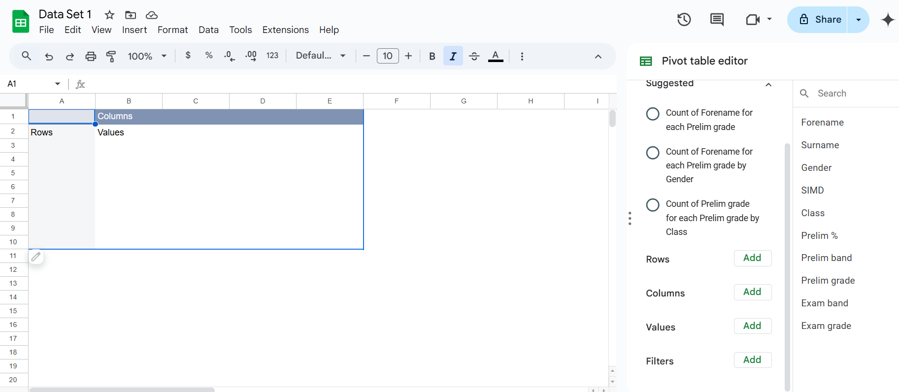
- Click "Create": This will open a new sheet (or the designated area) with an empty pivot table and the "Pivot table editor" on the right.
[
3. The Pivot Table Editor:
The editor is where you'll configure your pivot table. It has four main sections:
- Rows: Fields you want to appear as rows in your pivot table.
- Columns: Fields you want to appear as columns.
- Values: The data you want to summarize (e.g., sum, average, count).
- Filters: Used to filter the data included in the pivot table.
4. Building Your Pivot Table (Example Scenarios):
Scenario 1: Average Grade per Subject
- Rows: Drag "Subject" from the field list to the "Rows" section.
- Values: Drag "Grade" to the "Values" section. By default, it will probably show "SUM of Grade." Click on "SUM of Grade" and change the summarization to "AVERAGE."
Scenario 2: Number of Students Present/Absent in Each Subject
- Rows: Drag "Subject" to the "Rows" section.
- Columns: Drag "Attendance" to the "Columns" section.
- Values: Drag "Student Name" to the "Values" section. Change the summarization from "SUM" (which doesn't make sense here) to "COUNTA" (count of all entries). This will show the number of students (unique names) for each attendance status within each subject.
Scenario 3: Student Performance Breakdown (Grade by Subject)
- Rows: Drag "Student Name" to the "Rows" section.
- Columns: Drag "Subject" to the "Columns" section.
- Values: Drag "Grade" to the "Values" section. The default "SUM" will be used here and show the total grade for each student in each subject. You can change it to "AVERAGE" to see the average grade.
5. Filtering Data:
- Add a Filter: Drag a field (e.g., "Subject") to the "Filters" section.
- Select Filter Criteria: A filter control will appear above the pivot table. You can choose specific items to include or exclude (e.g., only show data for "Math").
6. Sorting Data:
- Sort by Row/Column: Click on the row or column header in the pivot table to sort the data in ascending or descending order.
7. Formatting:
- Number Formatting: Format the values in your pivot table (e.g., decimals, currency) just like you would in a regular spreadsheet.
- Conditional Formatting: Apply conditional formatting to highlight specific values (e.g., highlight failing grades).
8. Exploring and Iterating:
The real power of pivot tables comes from experimentation. Try different combinations of rows, columns, values, and filters to gain new insights from your data. The changes you make in the Pivot table editor are reflected instantly in the pivot table itself.
9. Refreshing the Pivot Table:
If you make changes to your original data, you'll need to refresh the pivot table to reflect those changes. Right-click anywhere within the pivot table and select "Refresh."
Example with More Detail (Scenario 1):
Let's say your data looks like this (simplified):
| Student Name | Subject | Grade | Attendance |
|---|---|---|---|
| Alice | Math | 85 | Present |
| Bob | Science | 78 | Present |
| Carol | Math | 92 | Present |
| David | Science | 80 | Absent |
| Eve | Math | 75 | Present |
Following the steps for Scenario 1 (Average Grade per Subject) would create a pivot table like this:
| Subject | AVERAGE of Grade |
|---|---|
| Math | 84 |
| Science | 79 |
This shows you at a glance the average grade for each subject.
This guide provides a solid foundation for using pivot tables. As you become more comfortable, you can explore more advanced features like calculated fields and grouping. Don't be afraid to experiment! The best way to learn is by doing.
Pivot Tables in Excel
This guide will walk you through creating and using pivot tables in Microsoft Excel. We'll use a sample dataset, but you can easily adapt these steps to your own data.
1. Prepare Your Data:
- Organized Columns: Ensure your data is in a tabular format with clear column headers (e.g., Student Name, Subject, Grade, Attendance). Each column should represent a specific variable.
- Consistent Data Types: Keep data types consistent within each column (e.g., all grades as numbers, all names as text). This is crucial for accurate analysis.
- No Blank Rows/Columns: Avoid blank rows or columns within your data range, as this can confuse the pivot table.
- Example Data: Let's imagine a simplified example with columns: Student Name, Subject, Grade, and Attendance (represented as "Present" or "Absent").
2. Create the Pivot Table:
- Select Your Data: Click and drag to select the entire range of your data, including the header row.
- Insert Pivot Table: Go to the Insert tab on the Excel ribbon and click PivotTable.
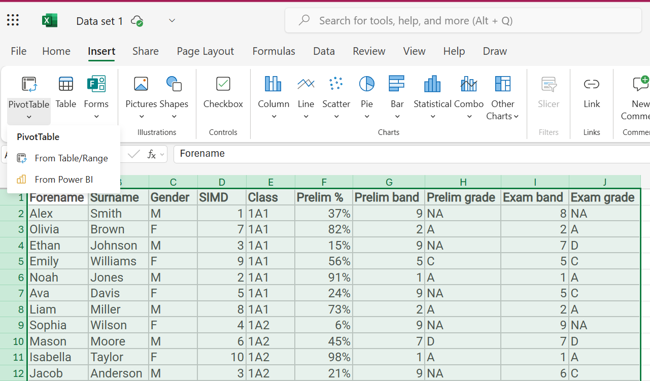
- Choose Location: A dialog box will appear. Choose where you want to create the pivot table:
- New Worksheet: This is usually the best option.
- Existing Worksheet: Choose this if you want the pivot table on the same sheet as your data (but be careful not to overwrite anything).
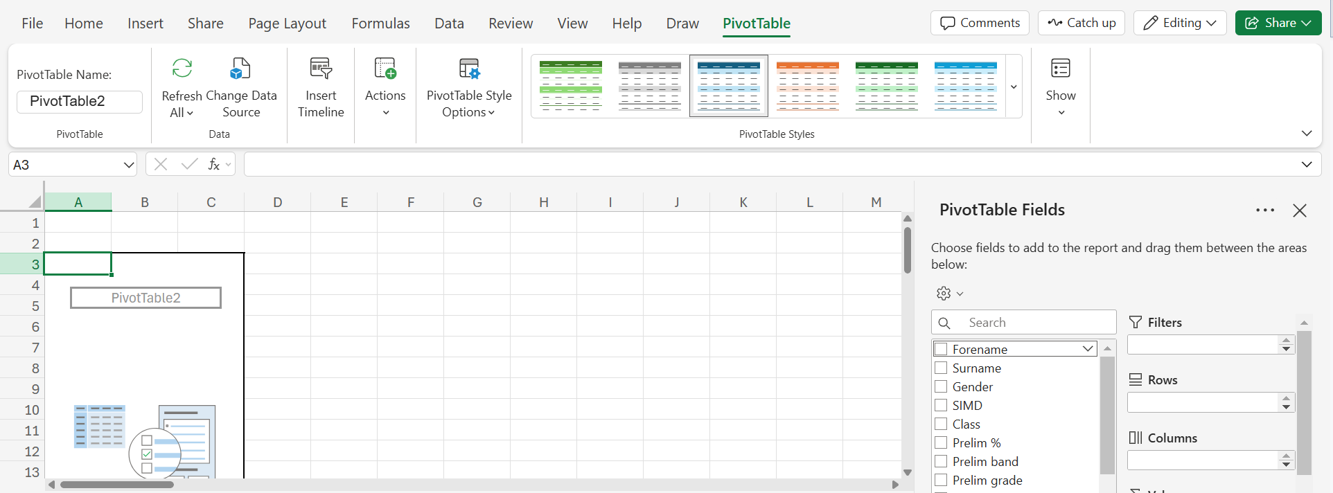
- Click "OK": This will open a new worksheet (or the designated area) with an empty pivot table and the "PivotTable Fields" pane on the right.
3. The PivotTable Fields Pane:
The pane is where you'll configure your pivot table. It has four main areas:
- Filters: Used to filter the data included in the pivot table.
- Columns: Fields you want to appear as columns.
- Rows: Fields you want to appear as rows.
- Values: The data you want to summarize (e.g., sum, average, count).
4. Building Your Pivot Table (Example Scenarios):
Scenario 1: Average Grade per Subject
- Rows: Drag "Subject" from the field list to the "Rows" area.
- Values: Drag "Grade" to the "Values" area. By default, it will probably show "Sum of Grade." Click on the dropdown arrow next to "Sum of Grade" in the Values area, select "Value Field Settings," and change the summarization to "Average."
Scenario 2: Number of Students Present/Absent in Each Subject
- Rows: Drag "Subject" to the "Rows" area.
- Columns: Drag "Attendance" to the "Columns" area.
- Values: Drag "Student Name" to the "Values" area. Click on the dropdown arrow next to "Sum of Student Name" in the Values area, select "Value Field Settings," and change the summarization to "Count." This will show the number of students (unique names) for each attendance status within each subject.
Scenario 3: Student Performance Breakdown (Grade by Subject)
- Rows: Drag "Student Name" to the "Rows" area.
- Columns: Drag "Subject" to the "Columns" area.
- Values: Drag "Grade" to the "Values" area. The default "Sum" will be used here and show the total grade for each student in each subject. You can change it to "Average" to see the average grade.
5. Filtering Data:
- Add a Filter: Drag a field (e.g., "Subject") to the "Filters" area.
- Select Filter Criteria: A filter control will appear above the pivot table. You can choose specific items to include or exclude (e.g., only show data for "Math").
6. Sorting Data:
- Sort by Row/Column: Click on the row or column header in the pivot table to sort the data in ascending or descending order.
7. Formatting:
- Number Formatting: Format the values in your pivot table (e.g., decimals, currency) just like you would in a regular spreadsheet.
- Conditional Formatting: Apply conditional formatting to highlight specific values (e.g., highlight failing grades).
8. Exploring and Iterating:
The real power of pivot tables comes from experimentation. Try different combinations of rows, columns, values, and filters to gain new insights from your data. The changes you make in the PivotTable Fields pane are reflected instantly in the pivot table itself.
9. Refreshing the Pivot Table:
If you make changes to your original data, you'll need to refresh the pivot table to reflect those changes. Right-click anywhere within the pivot table and select "Refresh."
Example with More Detail (Scenario 1):
Let's say your data looks like this (simplified):
| Student Name | Subject | Grade | Attendance |
|---|---|---|---|
| Alice | Math | 85 | Present |
| Bob | Science | 78 | Present |
| Carol | Math | 92 | Present |
| David | Science | 80 | Absent |
| Eve | Math | 75 | Present |
Following the steps for Scenario 1 (Average Grade per Subject) would create a pivot table like this:
| Subject | Average of Grade |
|---|---|
| Math | 84 |
| Science | 79 |
This shows you at a glance the average grade for each subject.
This guide provides a solid foundation for using pivot tables. As you become more comfortable, you can explore more advanced features like calculated fields and grouping. Don't be afraid to experiment! The best way to learn is by doing.
3.3. Filtering and Sorting
Sorting and Filtering Data in Spreadsheets
This section will guide you through the basics of sorting and filtering data in spreadsheets, specifically using Google Sheets and Microsoft Excel. These are fundamental skills for organizing and analyzing your data effectively.
Why Sort and Filter?
- Organization: Arrange your data in a logical order for easier understanding.
- Analysis: Focus on specific subsets of data to identify patterns and trends.
- Reporting: Extract relevant information for reports and presentations.
Sorting Data
- Concept: Sorting rearranges rows in your spreadsheet based on the values in one or more columns.
- Example: Sorting a list of student names alphabetically or arranging test scores from highest to lowest.
Steps to Sort
- Select the Data: Select the range of cells you want to sort. Include header rows if you have them.
Google Sheets:
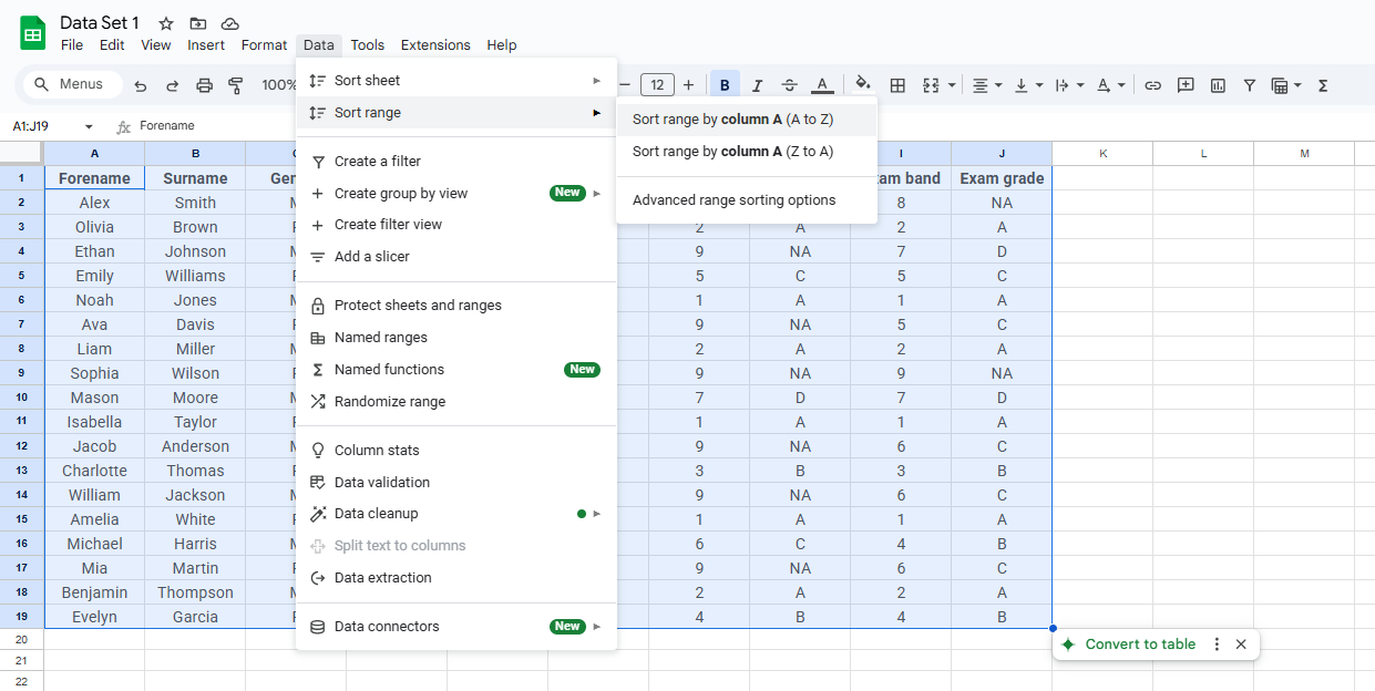
Go to "Data" > "Sort range" or right-click on a column letter and select "Sort sheet A to Z" or "Sort sheet Z to A". Choose the column to sort by and the sort order (ascending or descending).
Excel:
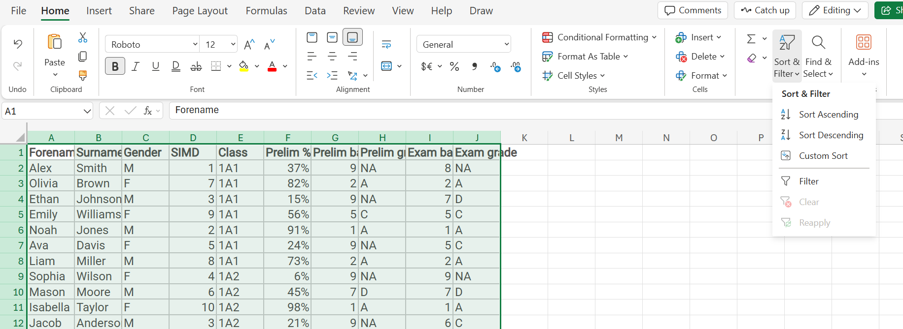
Use the "A to Z" or "Z to A" quick sort buttons. Alternatively, go to the "Data" tab and click "Sort". In the Sort dialogue box, specify the column to sort by and the sort order.
Filtering Data
- Concept: Filtering temporarily hides rows that don't meet specific criteria, allowing you to focus on a subset of your data.
- Example: Filtering a student list to show only students in a specific grade or those who scored above a certain mark.
Steps to Filter
- Apply Filter:
Google Sheets:
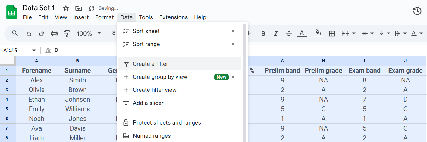
Select your data range, then go to "Data" > "Create a filter". Dropdown arrows will appear in the header row.
Excel:
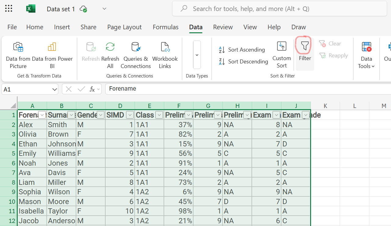
Select your data range, then go to the "Data" tab and click "Filter". Dropdown arrows will appear in the header row.
- Set Criteria: Click the dropdown arrow in the column you want to filter and select the criteria. You can choose specific values, use text or number filters, or create custom filters.
- Clear Filter: To remove the filter, in Google Sheets, click "Data" then "Remove filter". In Excel, click the filter button again.
Use Cases
- Student Performance Analysis: Filter student data to view only those who scored below a certain grade in a test. Sort by test scores to identify top and bottom performers.
- Attendance Tracking: Filter attendance data to identify students with a high number of absences. Sort by attendance percentage to identify trends.
- Behaviour Analysis: Filter behaviour incident reports to show only incidents of a specific type. Sort by date to analyze patterns over time.
- Identifying Students Needing Support: Filter student data to show only those with specific learning needs. Sort by assessment scores to prioritize support.
- Creating Class Lists: Filter student data to show only students in a specific class. Sort by last name to create an alphabetical class list.
Additional Tips
- Multiple Filters: Apply multiple filters to refine your results further.
- Clear Filters: Always clear filters when you're done to ensure you're viewing the complete dataset.
- Data Updates: If you change your data, remember that filters and sorts will reflect the current data.
Further Exploration
- Custom Filters: Explore advanced filtering options like custom formulas and conditional filters.
- Filter Views (Google Sheets): Use filter views to create multiple saved filter configurations.
- Slicers (Excel Tables): Use slicers for visually interactive filtering within Excel tables.
3.4. Googlesheets Function: IMPORTRANGE
Using Google Sheets: Importing Data with =IMPORTRANGE
This guide explains how to use the IMPORTRANGE function to bring data from one Google Sheet into another. This is incredibly useful for consolidating information, sharing specific data sets without granting access to the entire source sheet, and creating dynamic reports.
What is =IMPORTRANGE?
IMPORTRANGE allows you to pull data from a different Google Sheet into your current sheet. The imported data is live; if the source sheet changes, your sheet will automatically update. However, you cannot directly edit the imported data in the destination sheet. Changes must be made in the original source sheet.
Syntax:
=IMPORTRANGE("spreadsheet_url", "range")Let's break down each part:
=IMPORTRANGE: This is the function name that tells Google Sheets you want to import data."spreadsheet_url": This is the full URL of the source Google Sheet (the one containing the data you want). Make sure to enclose the URL in double quotes. You can find the URL in your browser's address bar when you have the source sheet open. It will look something like this:"https://docs.google.com/spreadsheets/d/[some_long_alphanumeric_code]/edit#gid=0"Crucially, you must include the entire URL, including the
https://...part."range": This specifies the cells you want to import. Use standard A1 notation (e.g., "A1:D10", "Sheet1!A1:B5", "Sheet2!C2:C"). Enclose the range in double quotes. For example:"A1:D10"imports data from cells A1 to D10."Sheet1!A1:B5"imports data from cells A1 to B5 on the sheet named "Sheet1". This is important if your source sheet has multiple tabs."C2:C"imports all data from column C, starting from C2.
Step-by-Step Example:
- Open the Source Sheet: Open the Google Sheet that contains the data you want to import.
- Copy the URL: Copy the entire URL from your browser's address bar.
- Open the Destination Sheet: Open the Google Sheet where you want to import the data.
- Enter the Formula: In the cell where you want the imported data to begin, type
=IMPORTRANGE("spreadsheet_url", "range"), replacing"spreadsheet_url"with the URL you copied and"range"with the desired cell range. For example:=IMPORTRANGE("https://docs.google.com/spreadsheets/d/[some_long_alphanumeric_code]/edit#gid=0", "Sheet1!A1:C20") - Authorize Access: The first time you use
IMPORTRANGEwith a new source sheet, you'll need to grant permission. A message will appear asking you to "Allow access." Click the "Allow access" button. This authorization is a one-time process for each source sheet. - Data Appears: Once authorized, the data from the specified range in the source sheet will appear in your destination sheet.
Important Considerations:
- Authorization: You only need to authorize access once per source spreadsheet.
- Updates: The imported data will automatically update whenever the source sheet is changed.
- Errors: If you see an error, double-check the URL and range. Also, ensure that you have the necessary permissions to access the source sheet (either you own it or it has been shared with you).
- Multiple Ranges: To import multiple non-contiguous ranges, you can use curly braces
{}. For example:=IMPORTRANGE("url", "{Sheet1!A1:B10, Sheet1!D1:E10}") - Sheet Names: Remember to include the sheet name in the range if you are not importing from the first sheet in the source spreadsheet.
Ways you might want to use this:
Consolidating Pupil Attainment DataA teacher with multiple classes (e.g., S1, S2, S3) uses separate spreadsheets for each class, recording CfE levels, assessment results, etc. They create a master spreadsheet and use |
Tracking Pupil Progress Across SubjectsA Guidance Teacher tracks pupil progress across subjects. Each subject teacher has their own spreadsheet. The Guidance Teacher uses |
Creating a Performance OverviewA teacher or Principal Teacher creates an overview of class/year group performance (CfE levels, average scores, progress). Raw data is in separate class spreadsheets. |
Sharing Data with ParentsA teacher shares a pupil's progress report with parents. The full class spreadsheet is confidential. The teacher creates a separate spreadsheet, using |
Collaborating on Pupil DataTeachers in a faculty collaborate on pupil data. One teacher maintains the master spreadsheet. Others use |
Generating ReportsA teacher or Principal Teacher generates reports for the SMT or Education Scotland (attainment data, progress, interventions). Raw data is in their spreadsheet. |
Tracking AttendanceA teacher combines attendance data (from SEEMIS) with other data. |
Tracking ASN InformationA teacher or support for learning teacher maintains a spreadsheet with ASN information. |
You may want to watch this tutorial
3.5. Googlesheets formula: =FILTER
Using Google Sheets: Filtering Data with =FILTER
This guide explains how to use the FILTER function in Google Sheets to extract data from a range based on specific criteria. This is incredibly useful for creating targeted views of your data, analyzing subsets of information, and generating dynamic reports.
What is =FILTER?
FILTER allows you to select rows from a range that meet one or more conditions. It returns a new range containing only the rows that satisfy the criteria. The original data remains unchanged.
Syntax:
=FILTER(range, condition1, [condition2, ...])Let's break down each part:
=FILTER: This is the function name.range: This is the range of cells you want to filter (e.g., "A1:D10", "Sheet1!A1:B5").condition1: This is the first condition that must be met. It usually involves a comparison (e.g., "A1:A10 > 70", "B1:B10 = "Maths"").[condition2, ...]: (Optional) Additional conditions. All conditions must be true for a row to be included in the filtered result.
Step-by-Step Example:
- Open the Spreadsheet: Open the Google Sheet containing the data you want to filter.
- Enter the Formula: In the cell where you want the filtered data to begin, type the
FILTERformula. For example, to filter data in the range A1:D10 where values in column C are greater than 80:=FILTER(A1:D10, C1:C10 > 80) - Data Appears: The rows that meet the condition(s) will appear in the destination range.
-
AND Logic (Multiplication
*): In Google Sheets'FILTERfunction, when you multiply two or more conditions, it's treated as an "AND" operation. This means that all the conditions must be true for a row to be included in the filtered results. Think of "TRUE" as 1 and "FALSE" as 0. When you multiply conditions, if even one condition is FALSE (0), the result is 0 (FALSE), and the row is excluded.
Example:(C1:C10 > 80) * (D1:D10 = "Pass")means "show rows where the value in column C is greater than 80 AND the value in column D is 'Pass'." -
OR Logic (Addition
+): When you add two or more conditions, it's treated as an "OR" operation. This means that at least one of the conditions must be true for a row to be included. If any of the conditions result in a "TRUE" (a value greater than 0) the result of the addition will be greater than zero, and therefore the row will be included.
Example:(C1:C10 > 80) + (D1:D10 = "Pass")means "show rows where the value in column C is greater than 80 OR the value in column D is 'Pass'.
Important Considerations:
- Conditions: Conditions can use various operators like >, <, =, <>, >=, <=. You can also use text comparisons (e.g., `= "Maths"`).
- Multiple Conditions: Use commas to separate multiple conditions. All conditions must be true for a row to be included.
- Array Formulas:
FILTERis an array formula, meaning it can return a range of cells. It automatically spills into adjacent cells as needed. This means the results of theFILTERformula will automatically fill the cells below and to the right of the cell where you enter the formula. If you have data in the cells where the filter is trying to display its results, you will get an error. - Blank Cells:
FILTERwill ignore blank rows in the `range`. - No Matching Data: If no rows match the criteria,
FILTERwill return a `#CALC!` error. You can wrap the `FILTER` in an `IFERROR` to handle this. For example:=IFERROR(FILTER(A1:D10, C1:C10 > 80), "No matching data")
Ways you might want to use this:
Filtering Pupil Data by Grade LevelA teacher wants to see only the data for pupils in a specific stage (e.g., S3). They use |
Finding Pupils Who Scored Above a Certain MarkA teacher wants to identify pupils who scored above a certain mark on an assessment. They use
|
Filtering for Pupils in a Specific ClassA teacher with multiple classes wants to view data for only one class. They use |
Combining Multiple CriteriaA teacher wants to find pupils in S2 who scored above 80 on a particular test. They use |
Creating a List of Pupils Needing Additional SupportA teacher wants to create a list of pupils who are struggling in a particular subject. They use |
Generating a Report for Specific CriteriaA teacher needs to create a report showing data for a specific group of pupils (e.g., those receiving additional support). They use |
Analyzing Data by GenderA teacher might want to compare performance between male and female pupils. They can use |
Tracking Progress Over TimeA teacher could use |
You may want to watch this tutorial
3.6. Clean up your Data
Text Functions for Data Cleaning in Google Sheets
In education, data consistency is key. Inconsistent formatting of names, subjects, or other data can lead to inaccurate reports and wasted time. Google Sheets' text functions offer powerful tools to clean and standardize your data. This guide focuses on essential functions with real-world examples relevant to educators.
1. Understanding Text Functions
Text functions manipulate text strings within your spreadsheet. They're crucial for cleaning data, extracting information, and ensuring consistency.
2. Essential Text Functions:
TRIM: Removes extra spaces from the beginning, end, and within a text string. Useful for cleaning up data entered with inconsistent spacing.Example:
TRIM(" John Doe ")returns "John Doe".CLEAN: Removes non-printable characters (like line breaks) from text. Helpful for data imported from other systems.Example:
CLEAN("John" & CHAR(10) & "Doe")(whereCHAR(10)represents a line break) returns "JohnDoe".LOWER: Converts text to lowercase. Useful for standardizing text for analysis or comparison.Example:
LOWER("John Doe")returns "john doe".UPPER: Converts text to uppercase. Useful for standardizing text.Example:
UPPER("john doe")returns "JOHN DOE".LEFT: Extracts a specified number of characters from the left side of a text string.Example:
LEFT("John Doe", 4)returns "John".RIGHT: Extracts a specified number of characters from the right side of a text string.Example:
RIGHT("John Doe", 3)returns "Doe".MID: Extracts a specified number of characters from a text string, starting at a specified position.Example:
MID("John Doe", 6, 3)returns "Doe".CONCATENATE: Joins two or more text strings together. Useful for combining data from different columns.Example:
CONCATENATE("John", " ", "Doe")returns "John Doe". You can also use the ampersand (&) for concatenation:"John" & " " & "Doe"SPLIT: Divides text into multiple columns based on a specified delimiter (e.g., a comma, space, or other character).Example:
SPLIT("John,Doe", ",")will create two columns: one with "John" and the other with "Doe".
3. Real-World Examples for Educators:
a) Standardizing Student Names:
Imagine you have a spreadsheet with student names entered inconsistently:
| Name |
|---|
| john doe |
| John Doe |
| Doe, John |
| John Doe |
Here's how to clean it up:
TRIM: In a new column, use=TRIM(A2)(assuming "john doe" is in cell A2) to remove extra spaces.LOWERorUPPER: In another column, use=LOWER(B2)(assuming the trimmed name is in B2) to convert names to lowercase for consistency.SPLIT: If names are sometimes entered as "Last Name, First Name," use=SPLIT(C2,",")(assuming the lowercased name is in C2). This will split the name into two columns (Last Name and First Name).CONCATENATE(Optional): If you want to combine the split names back into one column as "First Name Last Name", use=CONCATENATE(D2," ",E2)(assuming the first name is in D2 and last name in E2).
b) Extracting Information from Combined Columns:
Suppose you have a column containing subject codes and class names:
| SubjectClass |
|---|
| MATH10A |
| SCI7B |
| ENG12C |
You can extract the subject code and class name separately:
LEFT:=LEFT(A2, 4)(assuming "MATH10A" is in A2) will extract the subject code ("MATH").RIGHT:=RIGHT(A2, 3)will extract the class name ("10A").MID: If the format was MATH-10-A you might use=MID(A2, 6, 2)to extract the grade level "10".
c) Cleaning Data from Different Sources:
When merging data from different systems, you might encounter inconsistencies in formatting. Text functions can help you standardize the data before analysis. For example, different systems might use different date formats. You can use text functions combined with date functions to convert these to a consistent format.
4. Tips for Effective Data Cleaning:
- Work in a Copy: Always work on a copy of your original data to avoid accidentally overwriting important information.
- Use Helper Columns: Create new columns to perform each step of your cleaning process. This makes it easier to track your changes and troubleshoot any errors.
- Test Your Formulas: Double-check your formulas to ensure they are producing the desired results.
- Automate: Once you have developed a cleaning process, you can often automate it by dragging the formulas down to apply them to all rows in your data.
By mastering these text functions, you can significantly improve the quality and consistency of your data, making analysis and reporting much more efficient and reliable. This guide provides a foundation. Experiment and combine these functions to tackle more complex data-cleaning challenges.
4. Data Literacy and Equity?
Closing the poverty gap requires a collaborative effort, and a positive data culture is the foundation for that collaboration. It's about empowering everyone in our settings to use data to understand their own progress and work together towards shared goals. By fostering a culture of transparency and shared learning, we can identify the challenges faced by students from disadvantaged backgrounds and develop targeted strategies to address them. This video provides practical examples of how a positive data culture can transform our approach to education and create a more equitable future for all students.
5. Be a Data Champion
You've now explored key aspects of data literacy and visualization. As a Data Champion, your role extends beyond simply understanding these concepts. It's about actively promoting a positive data culture within your setting, empowering others to use data effectively, and ensuring that data is used to drive equitable outcomes for all pupils.
This final section provides you with practical activities designed to solidify your knowledge and equip you to champion the data cause. By engaging with these tasks, you'll gain the confidence to:
- Advocate for Data Literacy: Clearly articulate the importance of data literacy in improving teaching and learning, mirroring the principles highlighted by Education Scotland.
- Promote Effective Data Visualization: Encourage the use of clear and accurate data visualizations to communicate insights and inform decision-making, building on the techniques you've learned.
- Foster a Positive Data Culture: Lead by example, demonstrating how data can be used to understand progress, identify challenges, and work collaboratively towards shared goals, particularly in closing the poverty-related attainment gap.
- Use Data for Equity: Use your knowledge to help identify and address equity issues within your setting.
Let's put your skills into action and empower you to become a true Data Champion!
Data Set: Student Performance Data
| Student Name | Gender | Class | SIMD Decile | Attendance (%) | Homework Completion (%) | Prelim (%) | Exam (%) |
|---|---|---|---|---|---|---|---|
| Alice Smith | F | 10A | 2 | 95 | 100 | 78 | 82 |
| Bob Johnson | M | 10A | 4 | 88 | 90 | 65 | 70 |
| Carol White | F | 10B | 1 | 92 | 95 | 92 | 94 |
| David Brown | M | 10B | 3 | 85 | 80 | 85 | 80 |
| Eve Davis | F | 10A | 5 | 90 | 85 | 70 | 75 |
| Frank Miller | M | 10A | 2 | 98 | 100 | 95 | 98 |
| Grace Wilson | F | 10B | 4 | 82 | 75 | 88 | 85 |
| Harry Moore | M | 10B | 1 | 75 | 70 | 60 | 65 |
| Ivy Taylor | F | 10A | 3 | 88 | 90 | 90 | 92 |
| Jack Anderson | M | 10A | 5 | 95 | 85 | 82 | 88 |
| Kelly Thomas | F | 10B | 2 | 90 | 80 | 75 | 80 |
| Liam Jackson | M | 10B | 4 | 85 | 70 | 98 | 95 |
Task: Data Analysis and Visualization
- Conditional Formatting:
- Apply conditional formatting to the "Prelim (%)" and "Exam (%)" columns to highlight:
- Scores above 90% in green.
- Scores below 70% in red.
- Use data bars to visualize the "Attendance (%)" and "Homework Completion (%)" columns.
- Apply conditional formatting to the "Prelim (%)" and "Exam (%)" columns to highlight:
- Pivot Tables:
- Create a pivot table to show the average "Prelim (%)" and "Exam (%)" scores for each class (10A and 10B).
- Create a pivot table to show the average "Attendance (%)" and "Homework Completion (%)" for each SIMD decile.
- Create a pivot table to show the average "Exam (%)" score for each gender in each class.
- Google Sheets Functions:
- IMPORTRANGE: If you have another sheet with student names and their corresponding teacher, use
IMPORTRANGEto bring that data into this sheet. - FILTER: Use the
FILTERfunction to:- Show only the data for students in class 10A.
- Show only the data for students with attendance above 90%.
- Show only the data for male students who scored above 80% in the exam.
- Text Functions:
- If the "Student Name" column had inconsistent capitalization, use the
PROPERfunction to capitalize the first letter of each name. - If there were extra spaces in the "Student Name" column, use the
TRIMfunction to remove them.
- If the "Student Name" column had inconsistent capitalization, use the
- IMPORTRANGE: If you have another sheet with student names and their corresponding teacher, use
Additional Tips:
- This data set is designed to be used in Google Sheets or Microsoft Excel.
- Feel free to modify or expand the data set to further explore different scenarios.
- For an extra challenge, try creating different types of charts to visualize the data (e.g., bar charts, scatter plots).
Communicating Data to Different Audiences
-
Task: Choose a dataset and create two different data visualizations for it – one for teachers and one for parents.
-
Consider: How would you tailor the visuals and language to each audience?
-
Discuss: What are the challenges of communicating data effectively to different stakeholders?
Predictive Analytics (Simplified)
-
Task: Explore basic predictive modelling using historical student data. For example, can you predict which students might be at risk of failing a course based on their past performance?
-
Tool: Use spreadsheet software
-
Reflection: Discuss the potential benefits and ethical considerations of using predictive analytics in education.
Storytelling with Data
-
Task: Choose a dataset related to student achievement or well-being.
-
Create: Develop a data-driven story that highlights a key trend or insight from the data.
-
Format: This could be a short presentation, a blog post, or even a social media post.
-
Focus: Emphasize clear visuals and a compelling narrative.
Interactive Data Dashboard
-
Task: Design a mock-up of an interactive data dashboard for teachers or school leaders.
-
Tool: Use a design tool like Canva, Figma, or even PowerPoint/Google Slides.
-
Content: What data would you include? How would you visualize it? Consider how users could interact with the dashboard to explore the data.
-
Presentation: Present your dashboard design to a colleague and gather feedback.
6. Get Ready for Session 3
Prepare for Session 3: Before you move onto session 3, please identify a specific dataset within your setting that you'd like to delve into.
This could be anything from attainment data to attendance rates. Having this ready will allow you to conduct a more in-depth analysis.