Session 2 - Data Literacy: Beyond the Basics
Completion requirements
View

3. Visulising your Data
Data Visualization Basics
Data visualization is the art and science of representing data graphically. By transforming raw data into visual formats like charts and graphs, you can:
- Communicate complex information clearly and concisely.
- Identify patterns, trends, and anomalies that might be difficult to spot in raw data.
- Engage your audience and make data more interesting and memorable.
Principles of Effective Visualization
- Clarity: The visualization should be easy to understand at a glance. Avoid clutter and unnecessary details.
- Accuracy: The visualization must accurately reflect the data and avoid misleading interpretations.
- Aesthetics: While clarity is paramount, an aesthetically pleasing visualization can enhance engagement and improve understanding. Use color, typography, and spacing effectively.
Choosing the Right Chart Type
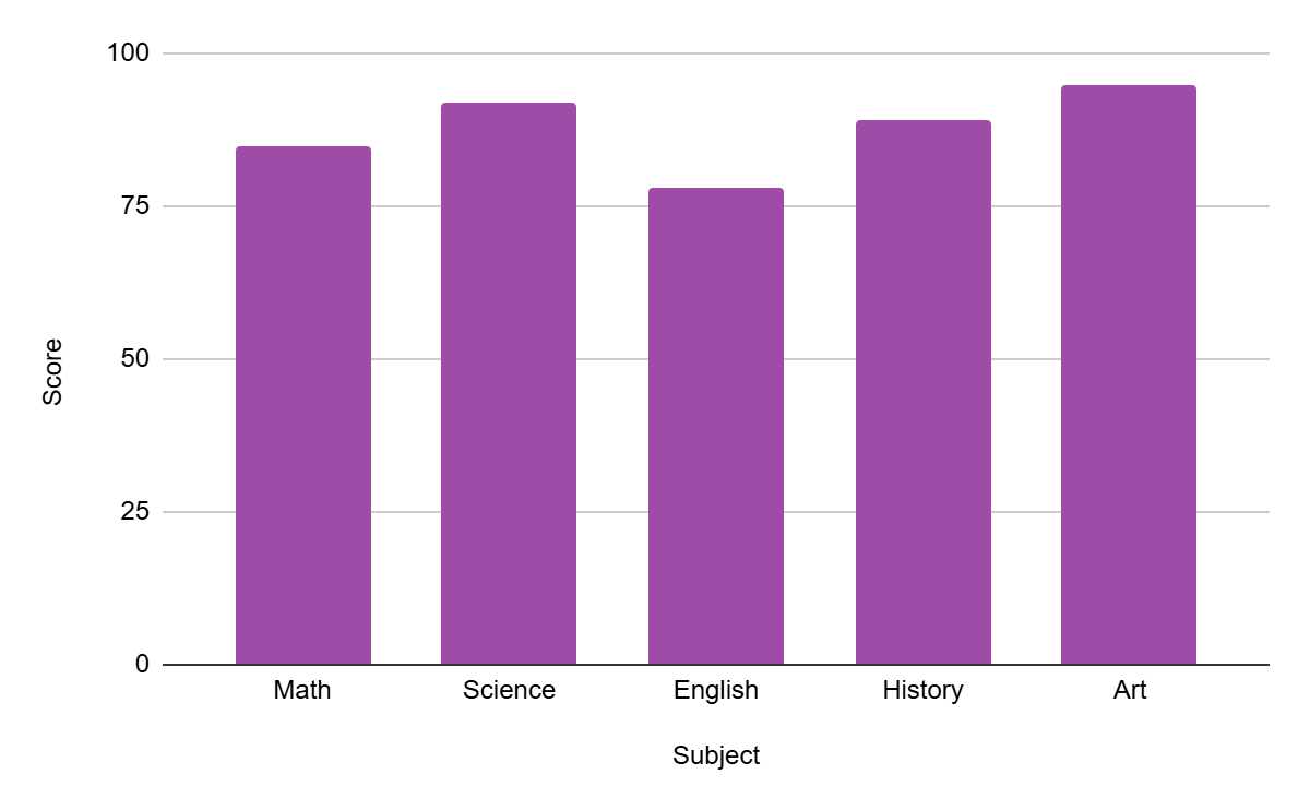
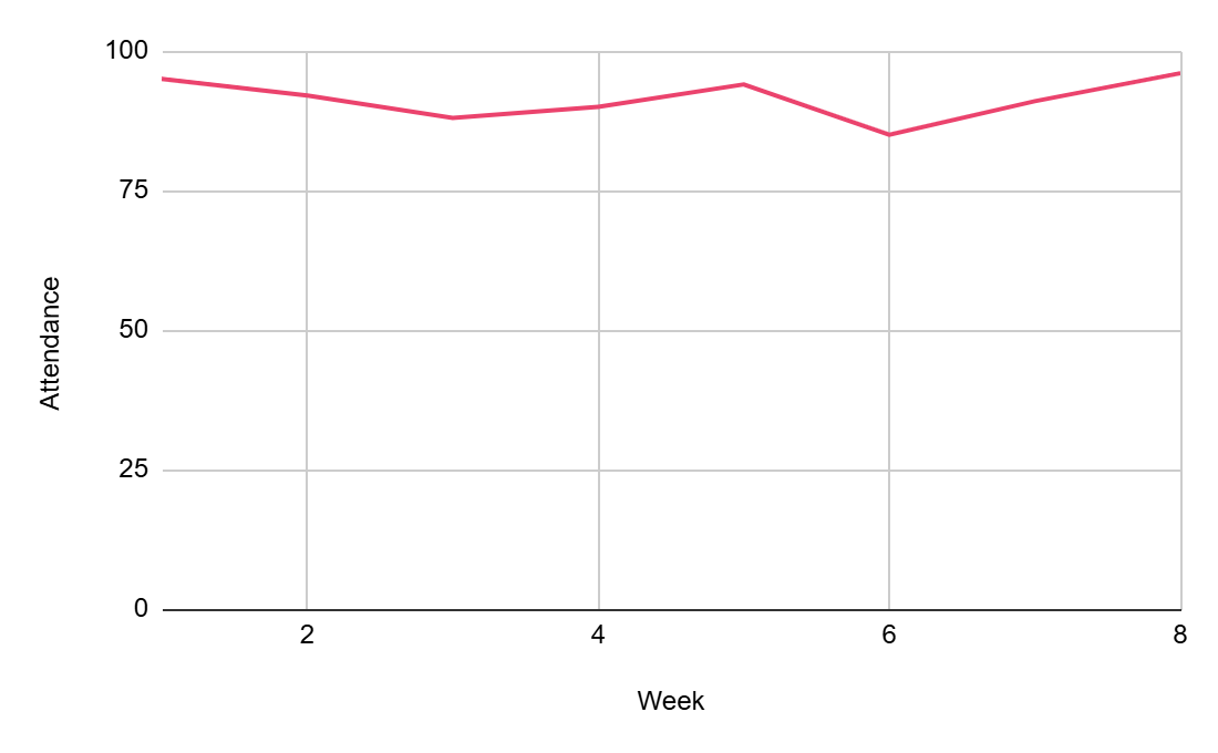
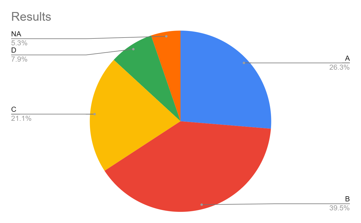
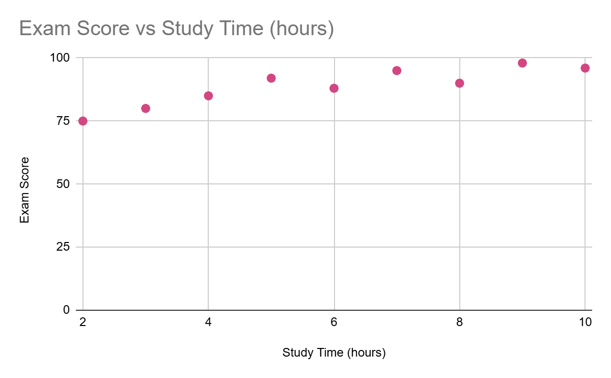
The choice of chart type depends on the type of data you are presenting and the message you want to convey. Some common chart types include:
Bar Charts
|
 |
|
Line Graphs:
|
 |
|
Pie Charts:
|
 |
|
Scatter Plots:
|
 |
|
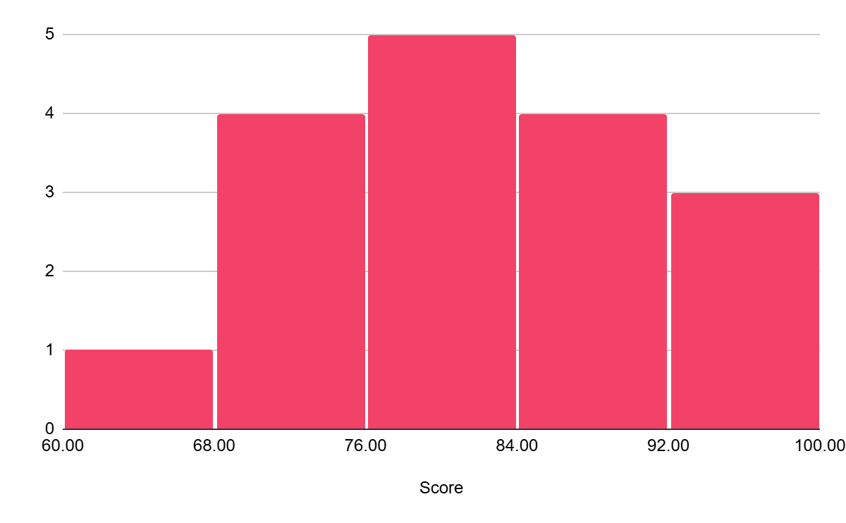
Histograms:
|
 |
Best Practices for Labeling and Formatting
- Clear Titles and Labels:
- Use concise and informative titles that accurately describe the visualization.
- Label axes clearly and include units of measurement (e.g., "Number of Students," "Years").
- Data Labels:
- Add data labels to individual data points to provide specific values.
- Use data labels judiciously to avoid cluttering the chart.
- Legends:
- Create clear and concise legends to explain the meaning of different colours, symbols, or patterns.
- Colour:
- Use colour effectively to highlight key trends, group data, and improve readability.
- Avoid using too many colours, which can be overwhelming.
- Font Choices:
- Use clear and easy-to-read fonts.
- Avoid using too many different fonts, which can make the visualization look cluttered.
- Whitespace:
- Use whitespace effectively to create visual breathing room and improve readability.
By following these principles and best practices, you can create effective and informative data visualizations that effectively communicate your findings.